The Rhythm of Design: Building and Testing My Portfolio’s Music Player

There's always been a couple of stories behind my designs; this one, however, is a funny one. At times when I sit down to design or research on something, I always tend to put LOFI music in the background, so that I can focus on the work properly. It's just an unconscious state of action at this point.
I realize now that I waste almost 5-10 minutes of my time first searching an appropriate music and eventually listening to my go-to music, now that is a serious concern for me.

me wasting time on finding the right music
So I thought, why not put up the most used music onto my portfolio? After all, it might help me gain more traction on my portfolio site and also enhance the user experience of the viewers.
These are the thoughts I had processed while coming up with the idea:
- Viewers can spend a lot of time on my portfolio site, which is gonna help me build traction on my portfolio
- LOFI musics are known for being calming, chill, and focus-friendly. Playing it in the background sets a relaxed mood while someone browses my portfolio. It makes the experience of reading case studies feel less like "reading a resume" and more like "exploring a creative space".
- A subtle audio background can keep users on my site longer (similar to how background music affects video games or cafes). The longer they stay, the more of my work they’ll see. I'm brilliant and I know it.
The Research Behind it
The goal of the research was to find, how many viewers follow the same pattern while working. So I had to pull up to my nearest colleagues who might share a similar OCD to mine.
I talked to about 4 individuals, 1 was a design director, 2 of them were fellow designers like me, and 1 of them had actually no clue about technologies- just a random web surfer, I must say. So this was what I came up with:
- 3 of them admitted to having used music (mostly LOFI) while working at almost 80% of their time.
- All of them mentioned that having played music in the background really helped them increase their attention level.
The Science Behind Background Music and Focus
Interestingly, research supports this idea. A study by Kiss & Linnell (2020) explored how preferred background music influences sustained attention. Forty students completed a vigilance task both in silence and with their self-selected music playing. The results? Background music increased task-focused states by reducing mind-wandering, without causing external distractions. In other words, the right kind of music helped participants stay more engaged without hurting performance.
This finding is closely tied to the “inverted-U” relationship between arousal and performance: when arousal levels are too low, our minds wander; when they’re too high, we get distracted. The sweet spot lies in the middle, and music can help push us toward it.
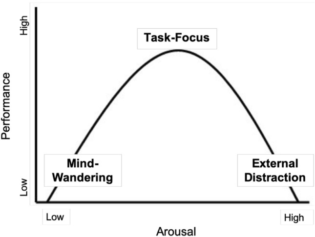
Inverted-U relationship between arousal, attentional states (mind-wandering, task-focus, external distraction) and performance, as hypothesised by Unsworth and Robison (2016) and in similar form Yerkes and Dodson (1908)
That’s exactly why I chose LOFI for my portfolio. LOFI’s steady beats and mellow textures tend to create just the right level of stimulation—enough to keep attention anchored, but not so much that it pulls focus away. And importantly, visitors can choose whether to enable the music, echoing the study’s point about user preference being key.
For me, this turns the music player from a fun design detail into a small experiment in user experience: can background music create a more focused, enjoyable browsing environment?
Following Up with Real User Recordings
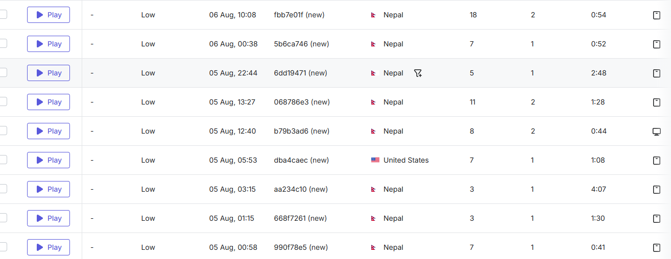
Visitors spent average 2 minutes on viewing my portfolio during earlier recordings
To complement the research I referenced, I decided to look at how people were actually interacting with my portfolio in practice. Using session recordings, I tracked visits to the page before my LOFI music player case study was featured.
What I noticed was that there were only a handful of time-stamped recordings, and most of them were fairly short:
- 0:41, 0:44, 0:52, 0:54 → users dropped off quickly.
- 1:08, 1:28, 1:30 → slightly longer engagement, but still brief.
- 2:48 → one of the longest sessions, though still under 3 minutes.
- 4:07 → the rare exception, but only a single case.
This suggests that while people did land on the page, many didn’t stay long enough to fully engage with the content or the player itself.
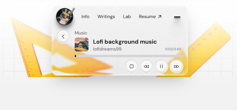
My Vision
I envisioned adding a lightweight music player to the navigation bar, allowing users to start listening to music at any moment.
Inspirations
1. Dynamic Island
I loved how Dynamic Island provides real-time, always-accessible interactions without interrupting the user’s flow. I wanted my music player to feel just as effortless—lightweight, floating in the navigation bar, ready to play music anytime.
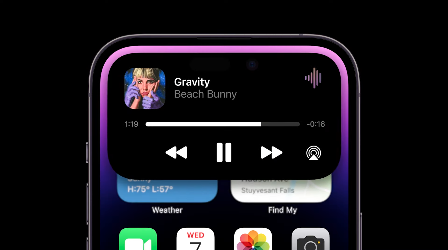
Music player on dynamic island
2. Windows Media Player
I loved how Dynamic Island provides real-time, always-accessible interactions without interrupting the user’s flow. I wanted my music player to feel just as effortless—lightweight, floating in the navigation bar, ready to play music anytime.
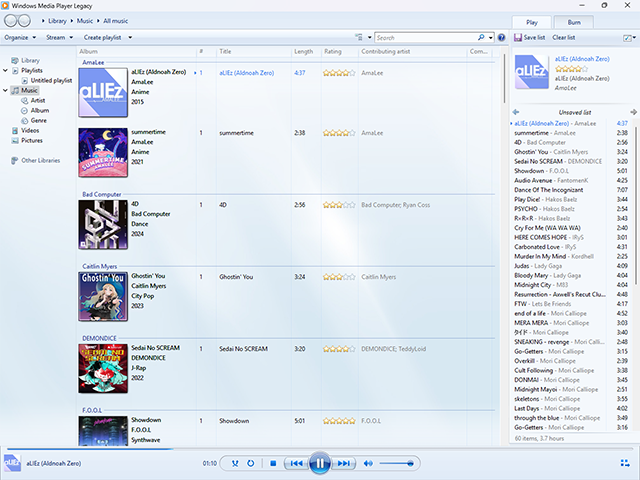
Windows media player on windows 7
Features
Effortless Navigation
Effortless navigation between main projects and the music player, letting users seamlessly explore my portfolio while keeping the music playing in the background. The player stays accessible yet unobtrusive, so visitors can jump between projects, dive into details, or skim through content without missing a beat. This design creates a fluid, interactive experience where music and exploration coexist harmoniously, adding a touch of delight to every visit.
Backed by CMS
Hardcoding each music onto the portfolio was never an option; good thing my portfolio was backed by awesome Sanity CMS.
Design
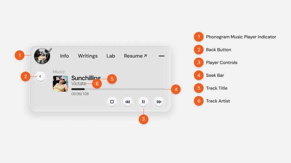
Designing for an interface component on top of liquid glass was a little bit tricky. With the refractive background, I had to make sure to keep the content as minimal as possible. Visitors shouldn't have to complete more than 3 clicks to play the music.
I had to make sure it had the fundamental controls to let visitors feel familiar with the controls of similar music players, following Nielsen Norman’s principle of Recognition over Recall and Consistency with Standards.
Even though I am quite confident in most of my design decisions, I had a second thought on this one, however. After all, this type of design implementation isn't quite familiar amongst other sites and might be something totally new to the visitors.
Usability Testing
It would've been absurd if I didn't test this approach before jumping onto my VS code. So I created a simple Figma prototype to test out with the users and used Useberry for my experiment.
I added the experiment embed to my portfolio for a day and gained 5 results.
Results
Participants: 5
- Completion Rate: 100% (no drop-offs)
- Average Time to Answer: 3.4s
Opinion Scale Results (Ease of Navigation):
- 5 (Easy peasy): 1 user (20%)
- 4: 3 users (60%)
- 3: 1 user (20%)
- 0–2 (Too complicated): 0 users
✅ Overall, all users completed the task quickly and rated navigation positively, with 80% scoring it 4 or higher.
See the full results here
Implementation
I had to make sure the component played music regardless of the route change, so I definitely had to place the React component in the root structure of my project.
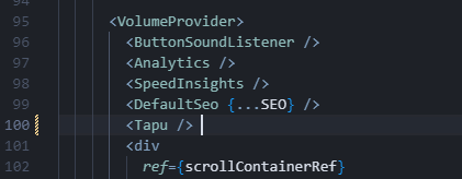
The "Tapu" is the name of the component, dont ask me why.
After being quite confident regarding the design, I added some animations to the transition and pushed to code to production with my fingers crossed. Luckily visitors loved it.
Final impact
After quite an implementation, I tested the use of the music player on my portfolio for quite a few days, by doing guerilla testing via Hotjar. After implementing the LOFI music player, there was a clear increase in both session length and user engagement. Previously, most users spent less than 3 minutes on the page, with only a rare session reaching just over 4 minutes. After the player was added, multiple visitors stayed 10–30 minutes, and one even spent over 46 minutes exploring the Chronologix case study.
Summary
The idea for my LOFI music player came from a personal habit: I always listen to LOFI while designing to stay focused, but I often waste time searching for the right track. To solve this, I integrated a lightweight player directly into my portfolio, giving both myself and visitors an immediate way to create a calm, focused browsing experience.
Research with colleagues and supporting studies confirmed that background music—especially LOFI—helps sustain attention and reduce mind-wandering. Inspired by Apple’s Dynamic Island and the simplicity of Windows Media Player, I designed a minimal, always-accessible player in the navigation bar, backed by Sanity CMS for easy management.
Following usability principles like Recognition over Recall and Consistency with Standards, I ensured the controls felt instantly familiar. Usability testing with 5 participants showed 100% completion, a 3.4s average interaction time, and 80% of users rating navigation 4 or higher, validating the design.
Implementation required making the player persistent across route changes, so I placed it in the project’s root and enhanced it with subtle animations.
After implementing the music player, session recordings revealed a significant increase in engagement. Previously, most users spent under 3 minutes on the page, but now multiple visitors stayed 10–30 minutes, and one user explored for over 46 minutes. This demonstrates that the LOFI player helped create a more immersive and enjoyable browsing experience, encouraging users to explore deeper content, stay longer, and engage more meaningfully with my portfolio.
References
Linnell, J. K., & Kiss, L. (2020, 08 03). The effect of preferred background music on task-focus in sustained attention. Retrieved from springer.